10 Retro Logos That Are Totally Too Much – And 10 That Still Look Incredibly Cool Today

Throughout history, logos have been the beating heart of brands—silent ambassadors that shout identity, style, and attitude with a single glance.
Some burst onto the scene with glitter, gradients, and groovy fonts, unapologetically flaunting the trends of their time. Others? They’re design royalty—timeless, effortless, and cooler than a leather jacket in a wind tunnel. Logos aren’t just visuals; they’re emotional time capsules, capturing the essence of entire eras.
Today, we’re throwing on our design goggles and hopping into a DeLorean for a nostalgic joyride through the world of retro logos. Get ready to wince at the ones that went full ‘extra’ (bless their over-the-top hearts) and cheer for those that still slay the style game decades later.
It’s a visual rollercoaster through neon, bevels, and brilliance as we explore 10 logos that scream “Too Much!”—and 10 that continue to serve timeless swagger like they never left the spotlight.
1. Coca-Cola

Step right up to a logo that has been fizzing with charm since 1886. The Coca-Cola logo, with its flowing Spencerian script, is the epitome of elegance and approachability. It’s like a fountain of youth in the branding world, refusing to age.
What’s its secret? Perhaps it’s the consistency in style or its ability to adapt without losing its essence. This logo has graced everything from soda cans to global billboards, making it one of the most recognizable symbols worldwide.
The Coca-Cola logo is a lesson in timeless design, balancing tradition with a dash of modern magic. Every curve and line seems to whisper tales of soda pop stands and summer picnics, a visual anthem that continues to sing through the ages.
2. Shell

Let’s shell-ebrate an emblem that’s been fueling imaginations since 1971. The Shell logo, with its bold lines and vibrant red and yellow scheme, is simplicity at its finest. It’s like a brand’s version of a little black dress – always in style.
Designed by Raymond Loewy, the logo’s brilliance lies in its uncluttered form, which has powered its iconic status. Whether you see it on a gas station or a business card, it’s instantly recognizable.
This logo proves that sometimes less is more, capturing attention without shouting. Its enduring appeal is a nod to its clever design and the perfect embodiment of brand identity. Truly, a shell of a time-tested classic!
3. IBM

Beam me up, IBM, with a logo that’s all about stripes and smarts. Designed by Paul Rand in 1972, these bold, striped letterforms convey speed and dynamism, reflecting the company’s transition from typewriters to computers.
This logo is like a visual marathon, racing ahead without breaking a sweat. Its strength lies in its simplicity and ability to communicate a technological evolution without uttering a word.
No need for unnecessary embellishments here – the IBM logo is a masterclass in minimalism, playing a pivotal role in redefining corporate branding. It carries a legacy of innovation and progress, one bold stripe at a time.
4. Woolmark

Let’s unravel the genius of simplicity with the Woolmark logo. Created in 1964 by Franco Grignani, this minimalist design of a stylized skein of wool is a woven wonder of quality and simplicity.
It’s like the cashmere of logos – soft, luxurious, and incredibly enduring. The Woolmark logo stands as a beacon of excellence, embodying the very fiber of what makes a great design.
Its charm lies in its ability to remain relevant in an ever-changing design landscape. This logo is proof that sometimes, the best designs are spun from simple threads. A knit-pick of perfection!
5. NASA ‘Worm’ Logo

Houston, we have a masterpiece. The NASA ‘Worm’ logo, used from 1975 to 1992, is a sleek, futuristic wordmark that embodies NASA’s forward-thinking mission. It’s a logo that’s truly out of this world.
With its minimalist design, the ‘Worm’ was a bold move into the future, reflecting the agency’s astronomical ambitions. Even after being retired, it remains a beloved symbol, proving that good design is timeless.
This logo is a stellar example of how simplicity can soar, leaving an indelible mark on both history and design. A cosmic classic that still captivates those who look to the stars.
6. Capri Sun

Sip back in time with the original Capri Sun logo, where bold outlines and 3D shadowing were all the rage. This logo screams ‘radical’ like a skateboarder in neon shorts.
While once iconic, it now feels like a relic of 1980s and 1990s design trends, a visual time capsule that brings with it a wave of nostalgia and a hint of graphic excess.
Though it may have lost its fizz in today’s minimalist design era, it remains a beloved piece of branding history, reminding us of the days when more was more. A juicy blast from the past!
7. Morton Salt
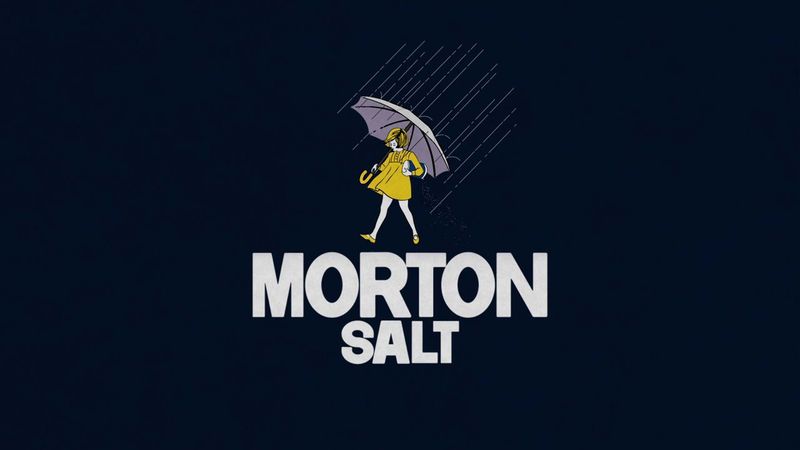
When it rains, it pours – nostalgia, that is. The Morton Salt logo, featuring the iconic Morton Salt Girl, has been sprinkling its way into hearts since 1914. But in today’s design landscape, her vintage illustration style seems a bit soggy.
Once a symbol of trust and reliability, the girl’s silhouette now feels like a ghost from a bygone era, longing for a contemporary makeover.
Despite its old-fashioned appearance, this logo remains a classic, a reminder of a time when logos were as much about storytelling as they were about branding. A salty salute to the past!
8. WestJet Airlines

Fasten your seatbelt, as we take off with a logo that’s in need of a fresh flight path. WestJet Airlines’ abstract logo, introduced in 2016, appears outdated, with clumsy spacing that makes it look like it’s been caught in a design turbulence.
While it aimed for modernity, the execution left it grounded, lacking the fresh perspective that today’s design-savvy travelers expect.
A redesign could help this logo soar to new heights, but for now, it remains a cautionary tale of why first impressions in branding really do matter. Ready for a design departure?
9. New York Times

Stop the presses! The New York Times logo, with its calligraphic typeface used since the mid-19th century, exudes a dignified presence that has weathered many a headline.
However, in the context of modern design trends, it may appear as old news, a classic type that’s ready to turn a new page.
While its historical significance is undeniable, a contemporary twist could rejuvenate its appeal, ensuring it remains as relevant as the news it delivers. A classic read with room for more stories!
10. King Arthur Flour
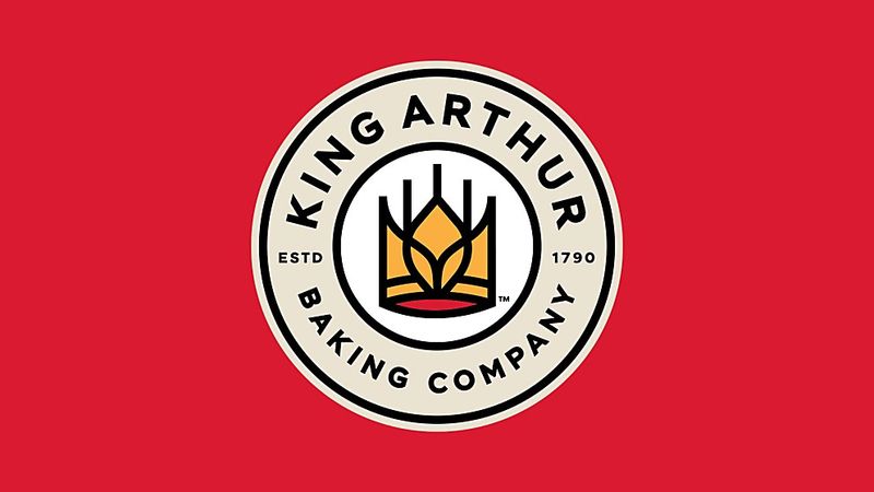
Knead we say more? The King Arthur Flour logo, with its detailed illustration of a knight on horseback, is a blend of history and complexity that’s as rich as the bread it helps bake.
While historically significant, its intricate design may seem overly complex in today’s minimalist world, much like a medieval tapestry in a modern art gallery.
Despite this, it remains a piece of branding history, perfect for those who appreciate a bit of chivalry with their flour. A knightly nod to the past in need of a modern quest!
11. Lucky Strike
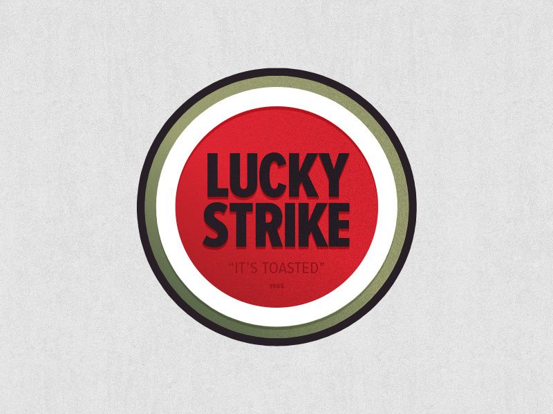
Here’s a logo that strikes a chord with both past and present. Lucky Strike, with its bold red and white target-like design, is the cigarette logo that defined an era and still smokes its competition.
Its simple yet striking design has maintained its charm over the years, blending vintage allure with a touch of modernity.
Whether you’re a fan or not, this logo is a testament to the power of bold simplicity in branding. A classic that’s truly ‘lit’ without being a drag!
12. Volkswagen

Start your engines and gear up for a logo that’s in the driver’s seat of design history. The Volkswagen logo, with its simple, overlapping V and W letters in a circle, is as timeless as the Beetle it once adorned.
This logo is the epitome of automotive elegance, proving that you don’t need horsepower to make a lasting impression.
As roads and technology have evolved, the Volkswagen logo has remained a constant, steering branding into the modern age with grace and class. A journey through time on four iconic wheels!
13. Pepsi-Cola
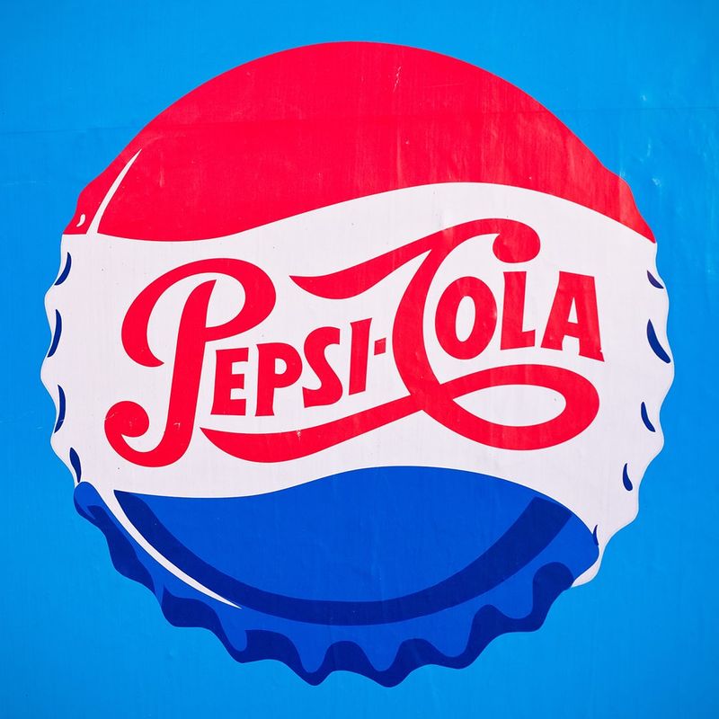
Pop open a can of nostalgia with the retro Pepsi-Cola logo, where swirling red and blue script takes center stage. This design is a fizzy celebration of mid-20th century energy.
While its vintage flair is unmistakable, it reminds us of a time when logos were bold, colorful, and full of life.
Even as Pepsi has evolved over the decades, this classic design remains a beloved part of its history, a reminder of soda fountains and youthful exuberance. A bubbly blast from the past!
14. Harley-Davidson

Rev your engines for a logo that’s the embodiment of freedom on two wheels. The Harley-Davidson logo, with its classic black and orange color scheme, is as rugged as the open road itself.
This design speaks to the heart of the brand, resonating with bikers and dreamers alike, capturing the spirit of adventure and rebellion with each ride.
As iconic as the roar of a Harley engine, this logo is a testament to brand identity that’s as unyielding as the bikes it represents. A road warrior in the world of design!
15. Apple
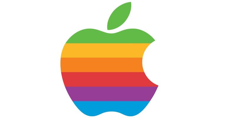
Think different with a logo that has bitten its way into the annals of design history. The retro Apple logo, with its rainbow color stripes, is a vivid symbol of innovation and creativity.
This logo was a colorful celebration of the dawning computer age, capturing the essence of Apple’s vision to bring color and life to technology.
Even as Apple has moved to a more minimalist design, the retro logo remains an endearing part of its legacy, a technicolor testament to the brand’s revolutionary spirit. A slice of design genius!
16. MTV

Crank up the volume for a logo that was as loud as the music it introduced. The original MTV logo, with its bold, colorful graffiti style, was a visual anthem of youthful energy and music culture.
This design was a radical departure from traditional logos, embodying a sense of rebellion and creativity that defined a generation.
While the channel has evolved, this logo remains a symbol of a time when music and culture collided in vibrant harmony. An iconic chorus of design!
17. Playboy

Hop into a world of sophistication and charm with the Playboy logo. The iconic bunny silhouette is a symbol of playful elegance that has transcended generations.
This logo is more than just a brand mark; it’s an emblem of a lifestyle, combining a sense of allure with a touch of class.
As relevant today as it was in the swinging sixties, the Playboy logo is a masterclass in effective branding, proving that sometimes, a simple silhouette can say it all. A design that’s as smooth as a martini!
18. Levi’s
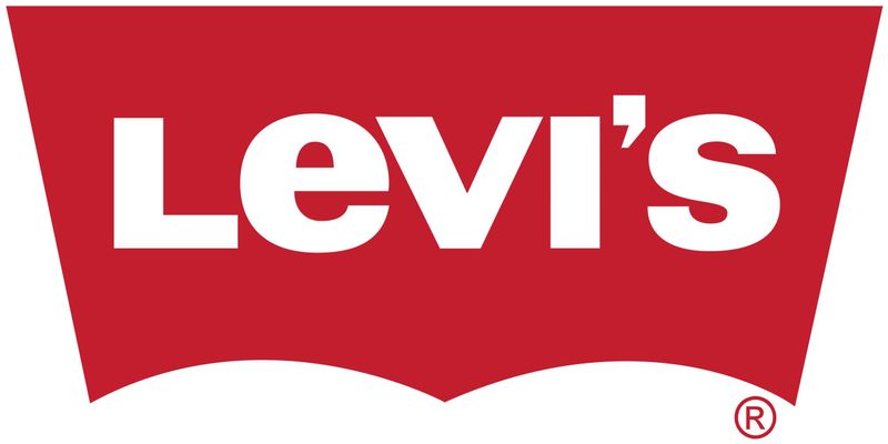
Button up for a classic that’s as enduring as a pair of Levi’s jeans. The Levi’s logo, with its classic red tab and white script, is an icon of ruggedness and Americana style.
This logo stands for more than just clothing; it represents a heritage of quality and authenticity that has spanned decades.
In a world of fast fashion, the Levi’s logo remains a steadfast symbol of timeless design, proving that true style never fades. A denim dream in branding!
19. Ford
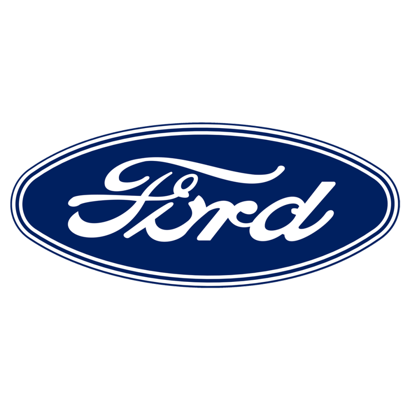
Ride along with a logo that’s driven through history with grace and reliability. The Ford logo, with its iconic blue oval and script, is synonymous with trust and innovation in the automotive industry.
This design has adorned countless vehicles, becoming a beloved symbol of quality and endurance on roads around the world.
From the Model T to modern marvels, the Ford logo has remained a constant in a changing world, a testament to a brand that’s truly built to last. A legacy on four wheels!
20. Cadillac
Shift gears into luxury with the Cadillac logo, an emblem of elegance and prestige. Its elegant crest and wreath are synonymous with the finer things in life, capturing the essence of American automotive luxury.
This logo is more than just a badge; it’s a statement of sophistication and excellence that has graced the front of many a luxury vehicle.
As the automotive landscape evolves, the Cadillac logo continues to represent a legacy of craftsmanship and opulence. A drive through design elegance!