
15 Dashboard Designs From The ’70s That Were More Confusing Than Helpful
The 1970s were a fascinating decade of bold innovation, not just in fashion and music, but in automotive design—especially when it came to dashboards. Car manufacturers were eager to embrace the future, experimenting with shapes, layouts, and technology that were meant to dazzle drivers with modernity.
Some of these dashboards genuinely pushed the envelope, introducing digital elements, space-age styling, and quirky ergonomics that hinted at what was to come. But for every success, there were plenty of head-scratchers. Many dashboards from this era became infamous for their overabundance of knobs, cryptic buttons, and odd placements that seemed to defy logic.
As someone who once spent a solid five minutes in a friend’s vintage car trying to find the glove compartment release—only to discover it was disguised as part of the faux wood paneling—I’ve learned to both laugh at and admire the creativity of 1970s car interiors. In this post, we’ll dive into 15 of the most memorable and mystifying dashboard designs from the decade.
From rotary dials that controlled who-knows-what to digital readouts that looked like they belonged on a spaceship, get ready for a ride through a wonderfully weird slice of automotive history.
1. Citroën GSA (1979)
Imagine trying to read your speed on a spinning drum while deciphering a digital graphic that seems to have a mind of its own. The Citroën GSA’s dashboard was a whirlwind of avant-garde design, leaving drivers more focused on decoding their speedometer than the road. This dashboard turned every drive into a puzzling adventure.
With its futuristic flair, it promised innovation but delivered confusion. Drivers accustomed to standard layouts might have felt like they were piloting a spaceship rather than a car. The challenge was as much about understanding the dashboard as it was about driving.
Despite its complexities, the GSA was a reflection of an era that dared to dream differently. But for those behind the wheel, it often became a test of patience and deciphering skills.
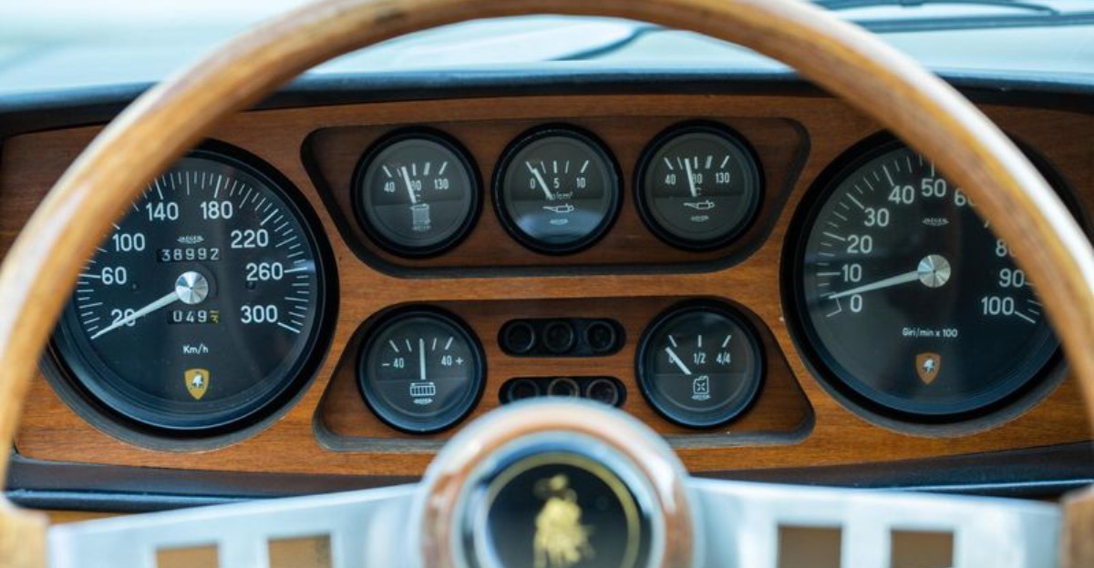
2. Lamborghini Espada Series III (1972)
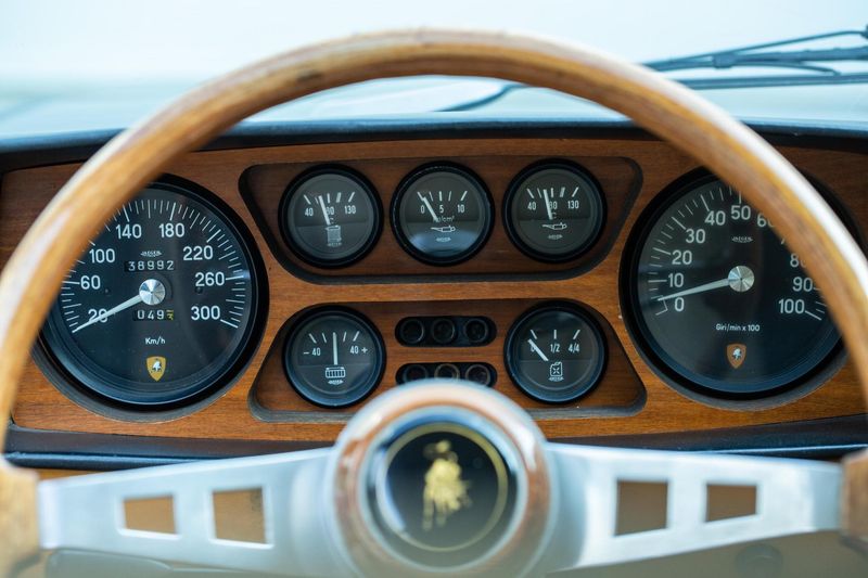
The Lamborghini Espada took luxury to a whole new level, but its dashboard was a maze of opulence. With a wraparound design and a radio nestled within the instrument cluster, drivers might have needed a map just to find the volume knob. This car was all about the experience, though sometimes it felt more like a scavenger hunt.
Its distinctive look was a statement, a testament to the boldness of the time. Yet, it left many wondering if the designers had swapped their engineering degrees for artistic licenses. The Espada’s dashboard was as much a conversation piece as it was a functional element of the car.
For those who loved a challenge, this dashboard was a delight. For others, it was a reminder that sometimes, less is more, especially when it comes to finding the air conditioning controls.
3. Maserati Boomerang Concept Car (1971)
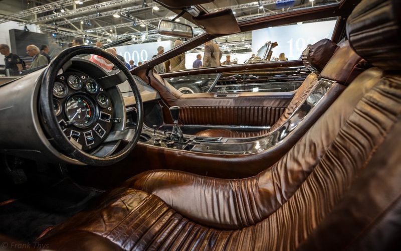
Zooming into the future, the Maserati Boomerang’s dashboard was more at home in a sci-fi movie than the streets. With its fighter cockpit-inspired steering wheel, drivers might have felt ready for takeoff rather than a leisurely drive. It was a design that challenged conventions and driver’s patience alike.
The Boomerang’s aesthetics were undeniably striking, capturing the daring spirit of the 1970s. However, the unconventional layout and controls might have left drivers longing for the simplicity of a regular steering wheel. This dashboard was the definition of form over function.
For those who relished the avant-garde, it was an exhilarating ride. For everyone else, it was a beautiful enigma that made even simple tasks feel like piloting a spacecraft.
4. Citroën 2CV (1970s)

The Citroën 2CV’s dashboard was as quirky as its umbrella-handle shifter. This car was an icon of simplicity, yet it took a unique approach to minimalism that often left drivers bemused. It was a dashboard that celebrated the unconventional, making every drive an eccentric delight.
Despite its oddities, the 2CV was beloved for its charm and personality. To some, the dashboard was a playful twist on traditional design; to others, it was a puzzling feature in an otherwise straightforward car. The shifter’s design was both endearing and perplexing, adding to the car’s unique flair.
For those who appreciated a bit of whimsy in their driving experience, the 2CV’s dashboard was a delightful companion. For everyone else, it was a reminder that simplicity can sometimes be a delightful challenge.
5. Jaguar XJ220 (1992)

The Jaguar XJ220 might be from the 90s, but its dashboard was a nod to the experimental spirit of the 70s. Featuring a second instrument binnacle on the driver’s door, drivers had to keep an eye on the gauges while navigating the road—a juggling act, to be sure.
This innovative layout was meant to enhance functionality, but often did the opposite. While the additional gauges provided more information, the unusual placement left drivers wondering where to look first. It was a dashboard that tested multitasking abilities and peripheral vision.
Innovative yet perplexing, the XJ220’s dashboard was a testament to pushing boundaries. Whether it was a success or a misstep depended on who you asked, but it certainly left a lasting impression.
6. Austin Allegro Vanden Plas (1975)
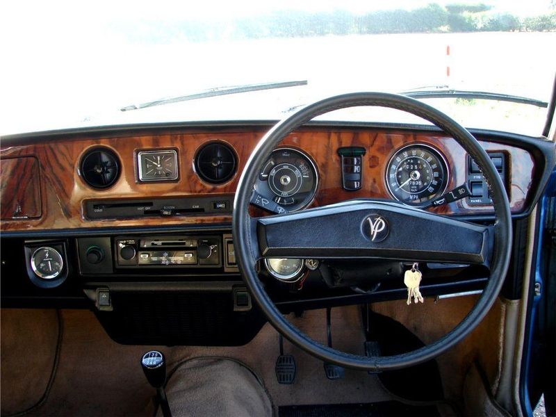
The Austin Allegro Vanden Plas featured a dashboard reminiscent of a gentleman’s club, with excessive wood trim and a confusing array of dials. The opulence was aimed at luxury but often overwhelmed drivers.
Its unique squared-off steering wheel added to the perplexity, making navigation through city streets an interesting challenge. Switching between controls felt like deciphering a complex code, requiring time and patience from its owner.
Despite its luxurious intentions, it was more a puzzle than a practical feature, leaving drivers questioning the design choices of its creators.
7. AMC Pacer (1975)
Quirky yet oddly charming, the AMC Pacer’s dashboard was as eccentric as the car itself. Its oval design and bright color accents made it a visual standout, albeit confusing in practice.
The asymmetrical layout of controls and instruments felt more like an art piece than a functional dashboard. Drivers often found themselves inadvertently adjusting settings while reaching for other controls.
This unorthodox design encapsulated the adventurous spirit of the ’70s but equally highlighted the decade’s occasional oversight of functionality in favor of aesthetics.
8. Chevrolet Corvette (1976)
The 1976 Chevrolet Corvette aimed for a futuristic cockpit experience, introducing digital displays amid a sea of buttons and switches. While visually striking, it left drivers bewildered rather than impressed.
The digital gauges were a novelty at the time, but their operation wasn’t as intuitive as hoped, causing frequent glances away from the road. The dense cluster of controls added to the chaos, demanding full attention from the driver.
This ambitious design sought to lead the market but instead became a narrative of trial and error.
9. Fiat 128 (1972)

The Fiat 128 showcased Italian design flair, yet its dashboard was a study in over-complication. Identical switches lined up in a neat row, but with no clear labeling, leaving drivers guessing their functions.
Small dials and a lack of visual hierarchy made the dashboard a cryptic feature to operate. This confusion was compounded during night drives when discerning controls became even more challenging.
While the Fiat 128 was celebrated for its driveability, its dashboard left much to be desired in terms of user-friendly design.
10. Ford Mustang II (1974)

Attempting to capture the iconic Mustang spirit, the Ford Mustang II’s dashboard was an overwhelming array of gauges. The disjointed aesthetic, wrapped in faux wood trim, provided little cohesion.
Drivers often struggled to focus on the essentials with so many distractions vying for attention. The placement and size of dials varied erratically, making information deciphering a chore.
Where simplicity might have sufficed, complexity reigned, resulting in a driving experience that was more about managing confusion than enjoying the ride.
11. Lotus Esprit Series 1 (1976)

The Lotus Esprit Series 1 came with ambitions of sleek minimalism, yet its dashboard’s style trumped functionality. Controls were sparsely placed, offering little intuitive guidance for drivers.
The minimalist design, while visually appealing, often led to confusion as essential controls were not immediately apparent. This lack of clarity required the driver to spend extra time familiarizing themselves with the layout.
In striving for elegance, the Esprit Series 1 demonstrated how style can overshadow practicality, leaving functionality in the rearview mirror.
12. Porsche 924 (1976)
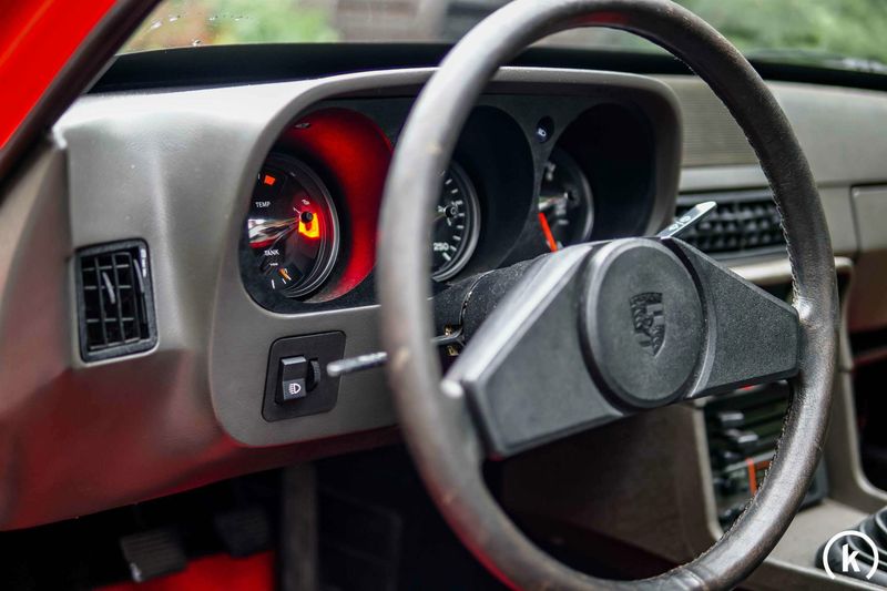
The Porsche 924’s dashboard was a mixed bag of design, filled with overlapping dials that compromised legibility. The cluttered arrangement made it difficult for drivers to quickly read necessary information.
Despite its sporty aspirations, the dashboard felt more like a technical maze, challenging the driver’s focus and patience. Navigating through features required deliberate attention, a task far from exhilarating.
This design choice became a conversation starter, highlighting a divergence between Porsche’s racing pedigree and user-centric design.
13. Renault 5 (1976)
The Renault 5 was a compact powerhouse with a dashboard that defied convention. Controls were spread unpredictably across the panel, ignoring traditional arrangements.
This unorthodox layout demanded drivers adapt quickly, often leading to moments of uncertainty when operating the vehicle. Finding the right switch could feel like a mini scavenger hunt.
While innovative in spirit, the Renault 5’s dashboard design was more of an acquired taste, revealing the era’s adventurous but sometimes impractical design experiments.
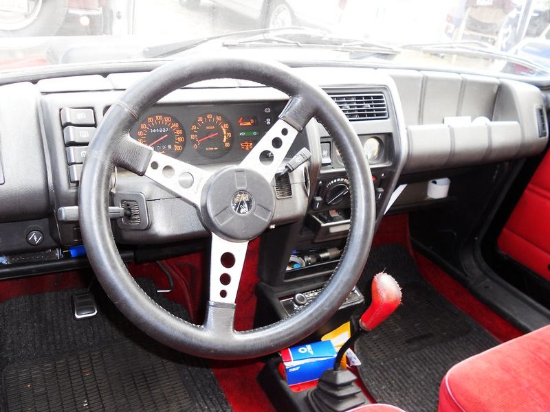
14. Saab 99 EMS (1974)
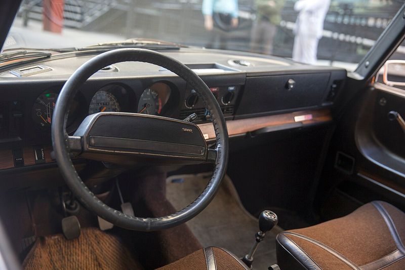
The Saab 99 EMS aimed for ergonomic brilliance but initially puzzled drivers with its unique design. Stalk controls and switches were unlike anything seen before, offering a steep learning curve.
The layout was meant to enhance driver comfort and efficiency, but first encounters often led to bewildered expressions. Familiarizing oneself with this dashboard required dedication.
Although praised in hindsight for its innovation, the design initially left many scratching their heads, representing the fine line between forward-thinking and user-friendly.
15. Toyota Celica (1977)

The Toyota Celica’s dashboard was a futuristic attempt that embraced the era’s love for buttons. A multitude of small controls filled the panel, creating a cluttered visual.
The instrument cluster was a busy spectacle, demanding the driver’s full attention to decipher its many signals. This design choice often overshadowed the car’s sporty appeal.
Aimed at innovation, it highlighted the tension between aesthetic ambition and practical usability, a common theme in 1970s automotive design.